
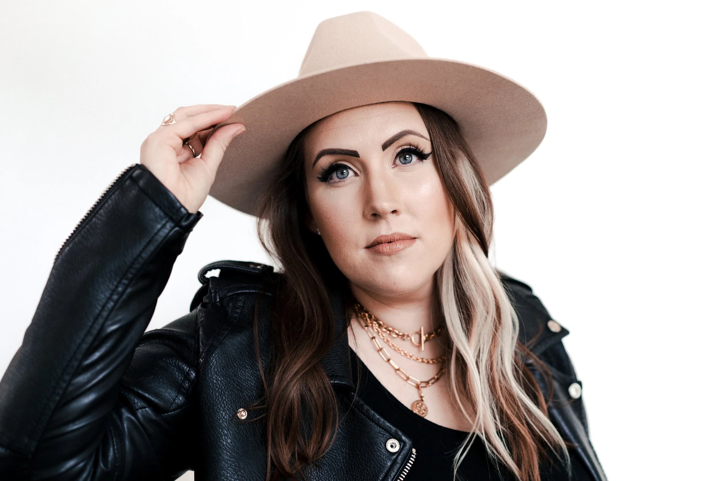
Brand Photos for Social Media: What to Shoot and What Kills a Good Image
Most businesses that invest in brand photography end up with the same complaint about three weeks later: the photos look great on the website and somehow wrong on Instagram. Faces get cut off at the top. The wide, airy shot that anchors the homepage turns into a lot of wall with a small person in it. The set runs out by week four.
None of that is a quality problem. It is a framing problem, and it happens because website images and social images are shot for completely different constraints — and almost nobody plans for the second one.
This is about the images themselves: the shapes they need to survive, how to shoot so nothing important gets cropped, and what actually earns attention in a feed. If you are working out what to post and how often, that is a different question and our social media content strategy guide covers the pillar and cadence side.
The Crop Is the Problem, Not the Photo
Here is the mechanic almost every business misses. When you upload a photo to a social platform, you do not control how it is displayed. The platform crops it — to a feed shape, to a grid thumbnail, to a circle, to a full-screen vertical.
A website hero image is composed for the opposite job. It is shot wide, horizontal, with intentional empty space on one side so a headline and a button can sit over it. That composition is correct for the website and actively bad for social, because the crop throws away the empty space you paid for and leaves the subject stranded at the edge of the frame.
So the same photo that makes your homepage look expensive can make your feed look amateur. The photo did not change. The container did.
The Four Shapes Your Photos Have to Survive
Every image you plan to use socially will get squeezed into one of four shapes. Knowing them before the shoot is most of the battle:
- Vertical feed, 4:5. The tallest shape a feed post can be, and the one that takes up the most screen. This is the default worth shooting for.
- Square, 1:1. What profile grids use for thumbnails. Even if you post at 4:5, the grid preview is square — so your subject needs to hold up when the top and bottom get trimmed.
- Full-screen vertical, 9:16. Stories and short-form video. Much taller than the feed shape, and much easier to get wrong.
- The circle. Profile photos on essentially every platform. A tight crop of the middle of the frame, displayed small.
Most platforms display images around 1080 pixels wide, so exporting near that width is plenty. Uploading the full-resolution print file does not improve anything — the platform recompresses it regardless.
Shoot Wider Than You Need
The practical technique that solves most of this is simple: frame a little looser than the final image, and keep anything essential out of the extreme edges.
If the subject is filling the frame edge to edge, every crop is destructive. If there is a margin of usable space around them, the same frame can become a 4:5 feed post, a 1:1 thumbnail, and a 9:16 story without a second shoot. Photographers call this shooting crop-safe, and it costs nothing at the time — it is a composition decision, not extra work.
The corollary: decide the destinations before the session, not after. That is the same argument we make in iPhone photos vs professional brand photos, where planned crops are one of the clearest differences between a snapshot and an asset you can actually deploy.
Watch the Top and Bottom on Vertical Video
Full-screen vertical has a specific trap. The top and bottom of a 9:16 frame are covered by interface — the account name, the caption, the action buttons, the progress bar. Anything you place there is either hidden or hard to read.
So when you shoot vertical, keep faces and any text you plan to overlay in the middle band of the frame. A portrait that looks perfectly composed in the camera can have its subject's chin sitting exactly where the caption lands.
Variety Comes From Distance, Not From More Frames
The most common reason a gallery runs out early is not the number of photos. It is that they all look the same.
Fifteen frames of one setup gives you one usable post and fourteen near-duplicates. What creates a feed that does not look repetitive is changing the distance:
- Wide. You inside your environment — the studio, the office, the shop. Establishes context.
- Medium. Waist-up, working, interacting. The workhorse of a feed.
- Tight. Hands, detail, product, texture. These carry carousels and fill the quiet slots.
Three distances across three setups gives you nine genuinely different images. Nine frames of one pose gives you one. Our guide to brand photography ideas works through shot concepts by where they get published, which is a useful companion when you build the list.
Leave Room for Words
A large share of what businesses post is not a bare photo — it is a photo with text on it. An offer, a quote, a headline, a testimonial.
Those posts need images with a quiet area big enough to hold the words: a clean wall, an out-of-focus background, open sky, a plain surface. If every image in your gallery is busy edge to edge, you cannot make a single graphic from it without covering someone's face.
Ask for a handful of frames with deliberate negative space. They will look slightly empty on their own, which is exactly why they work.
What Social Rewards That a Website Does Not
Beyond format, there is a genuine difference in what performs.
A website visitor has already stopped and is reading. They will sit with a wide, quiet, atmospheric image. A feed viewer is scrolling, and the image is competing at roughly thumbnail size. That changes what works:
- Faces beat objects. A person looking at the camera registers faster than a beautifully lit product.
- One clear subject beats a busy scene. If the eye has to hunt, the thumb has already moved.
- Specific beats generic. Your actual space, your actual product, your actual team. The reason custom brand photography beats stock is sharpest here, because feeds are where generic imagery is most obviously generic.
- A little imperfection helps. Over-retouched images read as advertising. Mid-motion, mid-laugh, mid-task frames read as real.
How Many Photos You Actually Need
Run the math before you book, because it changes what you ask for.
Posts per week times four is your monthly requirement, and you will not want to use every image you receive. Three posts a week is roughly twelve to fifteen usable images a month. A personal branding or brand session that delivers forty to seventy-five edited photos covers a few months comfortably — but only if the variety was planned. Shot as one look at one distance, the same seventy-five images cover about three weeks before your feed starts repeating.
That is the real argument for treating a shoot as a supply run rather than a photo appointment.
The Mistakes That Waste a Whole Gallery
Worth naming, because each one costs you the entire set:
- One outfit. Everything you post for two months looks like the same day, because it was.
- Every frame at the same distance. No carousels, no detail shots, no variety.
- Nothing shot vertical. Stories and short-form get nothing, which is where most reach lives.
- No breathing room. Beautiful, tight, uncroppable.
- Heavy retouching. Fine for a magazine, wrong for a feed built on trust.
Getting This Into Your Next Shoot
None of this requires a different photographer. It requires the destinations to be on the table before the camera comes out — which platforms, which shapes, how many posts a month, and how many of those need room for text.
That is exactly what the planning conversation is for on our social media content and brand photography sessions: the shot list is built backward from where the images will be published, so you leave with a set that is already the right shape. The rest of the prep — wardrobe, props, locations — is covered in the brand photoshoot preparation checklist.
Frequently Asked Questions
What size should brand photos be for social media?
Think in shapes rather than pixel counts. Feed posts run vertical at 4:5 or square at 1:1, stories and reels are 9:16, and profile photos are cropped to a circle. Most platforms display around 1080 pixels wide, so an export at that width is plenty — uploading a full-resolution print file just gets compressed anyway. The important part is that the photo was framed so it survives all of those crops, not that it was exported at a particular size.
Can I use my website photos on social media?
Some of them, but fewer than you would expect. Website hero images are shot wide with deliberate empty space for headline text, and that composition falls apart when a platform crops it to vertical or square — you end up with a lot of background and a small subject. The fix is to shoot both framings in the same session rather than trying to recover a social crop from a website image afterward.
How many photos do I need for social media each month?
It depends on cadence, but the math is simple: multiply your posts per week by four, then assume you will not want to use every image you get. A business posting three times a week needs roughly twelve to fifteen usable images a month. One session producing forty to seventy-five edited photos covers several months if the variety is planned, and covers about three weeks if everything was shot at the same distance in the same outfit.
Do social media photos need to be professionally shot?
Not all of them. Timely, in-the-moment posts are usually better on a phone, and audiences do not expect otherwise. What professional imagery gives you is the anchor material — images you would run as an ad, put on your website, or send to a publication — and the variety that keeps a feed from repeating itself. The practical split most businesses land on is professional anchors plus phone content in between.
What makes a photo work on social media but not on a website?
Social rewards faces, specificity, and a single readable subject, because the image is competing at thumbnail size in a scrolling feed. Websites can carry wide, quiet, atmospheric images because the visitor has already stopped and is reading. The same beautiful environmental shot that anchors a homepage often reads as empty in a feed, simply because the subject is too small to register at the size it gets seen.
Sitting on a gallery that does not fit your feed? Book a free strategy call — we will map your posting cadence to a shot list and shoot one session that comes back in the shapes you actually publish in.